
Sunny Kim
Design Critique #2
Website Design
Mr. Harper
04-13-26
POOR DESIGN
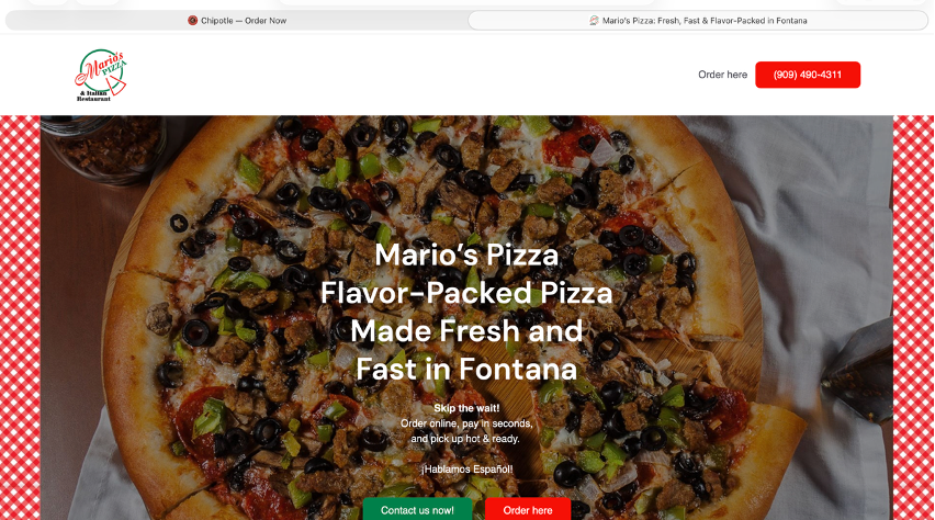
Overall Design:
Ranking 6 out of 10
The overall design of this website is not necessarily bad at first sight. I had a consistent color theme using green, red, and white. However, the bright red and green colors become distracting and make it harder to focus on the actual content. Most of the information is placed in the center of the page, leaving large empty spaces on the sides, which creates an unbalanced layout. This also makes the page feel longer than necessary. The menu layout is also confusing. Although it appears to be organized by categories such as deals, menu items, and sizes, the inconsistent text size makes it look unstructured and difficult to follow.
Navigation:
Ranking 8 out of 10
The navigation of this website is fairly effective. One of the first things I can see on the page is an order button, which is important since ordering food is the main purpose of a restaurant website. The header also includes a contact number, which is helpful for customers who prefer to call to order. Although the overall layout is not very well designed, the navigation through menus, deals, and different categories of pizza is still easy to follow. I was able to move through the site and find what I needed without much confusion.
Functionality:
Ranking 4 out of 10
This website seems functional at first, especially with the call button at the top for ordering. However, many sections, like lunch specials and menu items, are not clickable, making it difficult for users to navigate directly to what they want. The footer icons also look like buttons but are not interactive, which can be confusing.
Content Quality:
Ranking 6 out of 10
The content does match the purpose of the website, as it allows customers to view and order food. However, the quality of the content is poor. Instead of providing detailed descriptions or highlighting the restaurant’s strengths, the site mainly lists. menu items with prices. This may leave customers feeling like they don’t have enough information to make a decision or get confused.
Site Effectiveness:
Ranking 6 of out 10
This site does not strongly encourage customers to place an order. While it does provide basic information and access to the menu, the disengaging design and non-interactive feature make the experience less appealing. It fails to fully motivate users to order food, which is the overall purpose of the website.
EXCELLENT DESIGN
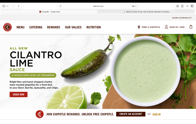
Overall Design:
Ranking 10 out of 10
The overall design of this website is very well done. It uses a consistent color of brown, white, and dark red, which creates a visually appealing and clean look. Although there is a large amount of content, including videos and images, the layout is organized in a way that prevents it from feeling cluttered. A photo promoting their new sauce grabs attention and supports the purpose of the advertising to new customers who have never tried it. The design feels inviting and easy to follow, with content clearly divided into sections, making it user-friendly.
Navigation:
Ranking 10 of out 10
The navigation of this website is clear and easy to follow. The buttons on the headers are straightforward, and each one directs users to the correct page with just one click, making it simple to find information when ordering. Even less common options are still easy to locate because the site is well organized. The content is divided into clear sections rather than being crammed together, allowing users to view and navigate the page comfortably. It is really easy to move through and find the way you need.
Functionality:
Ranking 9 of out 10
The content is clear and helpful for customers. It provides menu items, prices, and available options in an easy way. Calories and pictures are also listed for each item, and there are descriptions for new products, which help customers make choices. Additionally, the site includes useful features that make it easy to contact the business or download their app for rewards, which encourages customers more.
Content Quality:
Ranking 10 out of 10
The content quality of this website is great. It clearly shows menu items, pricing, and customization options in an easy way to understand. Each item is supported with a detailed description and nutrition information. The site also highlights new and popular items effectively, making the content both informative and engaging.
Site Effectiveness:
Ranking 9 of out 10
This website successfully allows customers to order the food they want while also helping them better understand the menu options. Clear sections and well-organized content make it easy to find information quickly. The simple and clean design improves the overall user experience and keeps everything easy to follow. This site is definitely user-friendly and encourages customers to return in the future.