

POOR DESIGN
https://www.villagefoodmarket.com/recipes.html
Overall Design:
Ranking 3 out of 10
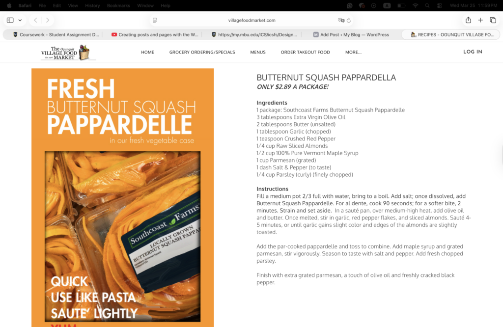
This website looks like very little effort is put into it. There is almost no color except for one orange picture on the left side, which makes the page feel unbalanced and disproportionate by taking up the whole left space of the website. The content on the right side is scrambled altogether and hard to read. Everything is in the same font with minimal formatting, and this makes the recipe confusing and not appealing.
Navigation:
Ranking 7 out of 10
Even though this is an example of poor design, the navigation was fairly easy to use. The bottom of the page includes the hours, and multiple ways to contact them, such as Instagram, email, and phone number, which is very helpful for user where to go when they have questions. The top of the page had clear buttons which make it easy for visitors to find what they want however, I found that some wording on the top can be a little confusing.
Functionality:
Ranking 2 out of 10
This website does not give clear step-by-step recipe instructions, which makes it difficult for someone who has never made this dish before. While the ingredients are listed with exact measurements, the directions are written as a paragraph instead of being broken into steps that are easy to read and follow. There are no videos, tips, or extra resources to help users, which makes it harder for people to successfully make the recipe. I also found one spelling mistake.
Content Quality:
Ranking 4 out of 10
The content does match the purpose of the website, which is to provide a recipe for butternut squash pappardelle. However, the way it is written makes it hard to follow, especially since the instructions are in dense text and the image takes up nearly half of the left side. Having an image can be helpful, but this image does not add much value to the website.
Site Effectiveness:
Ranking 2 of out 10
The website does provide the recipe to make butternut squash pappardelle, but it fails to make it easy or appealing for users. The overall presentation was not inviting, so visitors who didn’t know about this were not motivated to try the recipe or go through the site further.
EXCELLENT DESIGN
http://lolaeventproductions.com/
Overall Design:
Ranking 9 out of 10
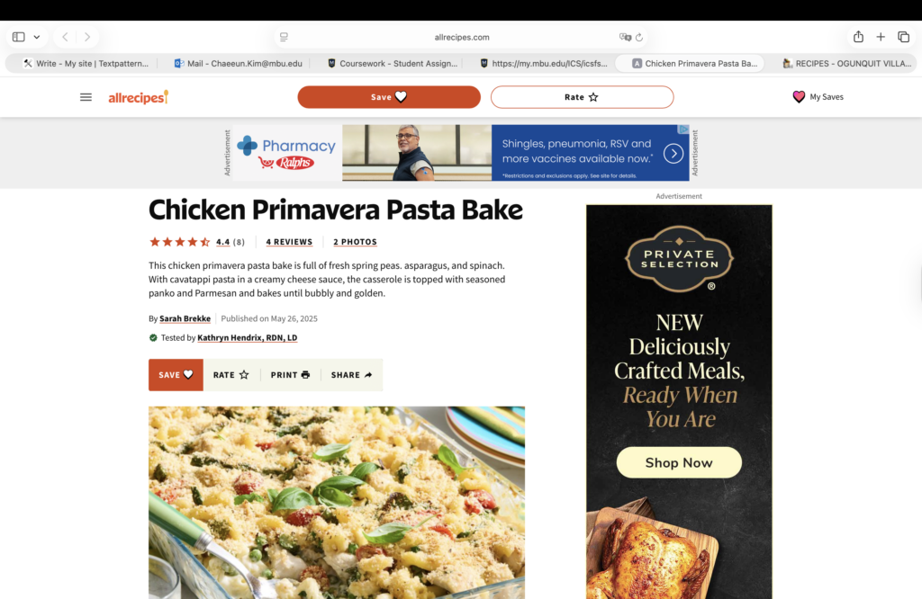
The website uses colors thoughtfully, mainly in the pictures and bullet points, so it does not feel overwhelming or chaotic. The introduction with the main image of the dish immediately grabs attention and makes the dish look delicious, encouraging visitors to keep reading and actually wanting to make the dish. The content is organized into clear sections that are easy to follow, but it can also feel like a little blend.
Navigation:
Ranking 9 out of 10
All the buttons at the top are clear, one-word labels, which makes it easy for visitors to find what they want. Factors like start rating, reviews, and photos build trust in the recipe. The ingredients section allows users to adjust the recipe for different servings. At the bottom, users can save the recipe for later, rate it, or even print it, which is very convenient if they can’t access to electronic later. There is also an Ask Community section where users can ask questions and get answers directly from the website owner, which helps them to interact together.
Funtionality:
Ranking 8 out of 10:
At the beginning of the website, it clearly shows prep time, cook time, total time, and servings, which makes it easy for users to plan. The ingredients are listed with exact measurements, and there is a step-by-step guide with detailed instructions and pictures for each step, which is especially helpful for beginners. Users can see the nutrition facts at the end, provide useful information for those tracking their diet. The only downside is that there are many advertisements going on that can be distracting.
Content Quality:
Ranking 10 out of 10
The content is very clear, detailed, and professional, making it easy to understand. The step-by-step instructions, along with images for each step, connect everything together and make the recipe much easier to follow. It also includes helpful features like timelines, adjustable serving sizes, and nutrition facts, which improve the overall quality of the content
Site Effectiveness:
Ranking 9 out of 10
The website will successfully draw people to make this recipe by making the recipe easy to understand and follow for all users. Its clear layout with detailed instructions and other factors makes visitors more likely to try the recipe and even review for more. The organized and simple design keeps users encouraged to return.